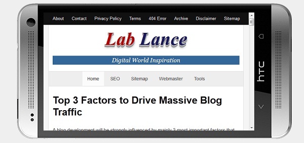
If your website or blog is not using media queries that
means it is not a mobile friendly site. You should make it media friendly using
@media screen css this technique in order to implement responsive design
functionalities to blog.
Media queries allow you to style elements for specific
devices (laptops, smartphones, tablets, Phablets, and desktop computers) by
using media screen attributes like width, height, aspect ratio, orientation, resolution.
By adding media queries CSS, presentations can be tailored to a specific range
of mobile devices without changing the blog style and content itself.
Media Screen CSS:
The @media statement specifies the target media types (base on width, height, and resolution attributes) of a set of statements. In the above CSS codes, we are specifying the screen media type. The max-width and min-width features are telling the mobile browser that at any screen size larger than 480px, but smaller than 960px, hide all div and elements with id="header"<link rel="stylesheet" media="screen and (min-width: 480px) and (max-width: 960px)" href="480-960.css" /><link rel="stylesheet" media="(max-width: 640px)" href="max-640px.css"><link rel="stylesheet" media="(min-width: 640px)" href="min-640px.css"><link rel="stylesheet" media="(orientation: portrait)" href="portrait.css"><link rel="stylesheet" media="(orientation: landscape)" href="landscape.css"><style>@media (min-width: 500px) and (max-width: 600px) {h1 {color: fuchsia;}.desc:after {content:" In fact, it's between 500px and 600px wide.";}}</style><!-- OR -->@media screen and (min-width: 480px) and (max-width: 960px) {#header {display: none;}}

No comments